Homesy — Brand Guidelines 2026
01 · Brand Identity
A care system for the things in your home. Two-tier membership: Free by default; £9.99/month for unlimited Diagnosis, an annual health check, cost-price repair and replacement.
Hover across the categories — each one marks what Homesy structurally is not.
Not insurance
No risk transfer, no claim mechanism. No premium against future claims.
Not a directory
Not a list of tradespeople. No commission on referrals. Advocacy depends on this.
Not a repairer
Homesy diagnoses and recommends. Engineers are partners, not employees.
What Homesy is
A care system for the things in your home. It monitors, diagnoses, and coordinates — giving homeowners ongoing visibility and control over the condition of their home.
Membership tiers
Free: Homesy account, appliance register, basic diagnostics. Pro — £9.99/mo: Unlimited Diagnosis, annual health check, cost-price repair and replacement.
Who it's for
Homeowners who want oversight — not emergencies. People who maintain rather than react. Typically 30–55, owns property, values competence and plain language over corporate warmth.
Brand positioning
Between insurance (risk transfer) and tradesperson directories (reactive referrals). Homesy is proactive care — a subscription that earns trust through usefulness, not promises.
Partner model
Engineers are vetted partners, not employees or commission earners. Homesy advocates for the homeowner first. If a repair isn't needed, Homesy says so — even if it means no job.
Never say
Don't compare Homesy to insurance, warranties, or boiler cover. Don't call it a "platform" or "marketplace". Don't use "peace of mind" — say what it actually does instead.
02 · Wordmark
No bespoke logotype, no decorative mark, no symbol or monogram. The wordmark is homesy — lowercase, set correctly, on the right surface. The case is deliberate: the logo sits below the homeowner, not above.
In running prose the brand name is written Homesy (capital H). The lowercase form is the logo only.
Capitalisation
The logo is always "homesy" in lowercase. Never "Homesy" or "HOMESY" as the mark itself — the capital H is for running prose only.
Typeface
Don't re-typeset the wordmark or substitute the typeface. Always use the exported SVG asset — never recreate it in another font.
Effects
No outlines, drop-shadows, gradients, emboss, or any effect on the wordmark. The mark is clean — it ships as-is.
Taglines
Don't attach "Your home, looked after." or any tagline directly to the wordmark. The brand line and logo are separate elements.
Colour
Forest green on light surfaces. White on dark. Never recoloured to match a partner palette, tinted, or rendered in any other hue.
Partner lockups
Don't lock up with a partner logo without brand sign-off. Clear space must be maintained — cap-height on all sides — in any co-branding.
03 · Colour
Forest green is the only brand colour. No secondary hue. Hover any swatch to lift it — click to reveal the full token detail.
Where contrast is needed, reach for paper, surface-green, or white — never a second brand hue.
Single brand colour
Forest green is the only brand colour. Never introduce a second hue as a brand accent — all personality comes from this one anchor.
No tints or shades
Do not create tints, shades, or gradients of --green. Use the defined palette tokens only. Transparency on white is permitted for overlays.
Functional colours last
--monitor and --alert are functional only — restricted to product UI status indicators. Never use them in brand marketing, print, or editorial.
Contrast minimum
All text must meet WCAG AA contrast. Body text (#2D3A33) on --paper or --white is compliant. Never place --mute text on --surface without checking.
Dark sections
On dark green backgrounds use white text only. Avoid --mute or --text on dark — they fail contrast. Logo on dark uses the white variant.
Backgrounds hierarchy
Alternate sections: --white → --paper → --surface. Never place two --paper sections adjacent. --alt (#FAFBFA) is the default page background.
04 · Typography
Georgia for substance. System sans for function. Headlines are Georgia regular (400), never bold. Use the sliders to feel the type scale live.
Georgia for display only
Use Georgia for headlines, sub-heads, and pull quotes only. Never for body text, UI labels, navigation, buttons, or form fields — those belong to system sans.
Never bold Georgia
Georgia is always weight 400 (regular). The serif letterforms carry visual weight on their own — bold makes headlines look heavy and off-brand. Italic is permitted sparingly.
System sans for function
Body copy, UI labels, navigation items, buttons, captions, and form fields all use the system sans stack. Font weight may vary: 400 body, 500 labels, 600 buttons.
Type scale
Hero display: 52–92px · Section heads: 38–44px · Card heads: 26–32px · Body: 15–16px · Supporting: 13px · Labels (caps): 11–12px. Never size body below 13px.
Spacing rules
Georgia display: letter-spacing −0.02em, line-height 1.05–1.1. Sans body: letter-spacing 0, line-height 1.65–1.78. Uppercase labels: letter-spacing +0.10–0.14em.
Hierarchy in practice
One Georgia headline per section. Do not stack two Georgia elements at similar sizes — establish clear hierarchy. Sub-heads may use sans medium (500) as a counterpoint.
05 · Layout, grid & spacing
A single max-width container, measured gutters, and a restrained spacing scale. Every layout decision traces back to these four core numbers.
Container widths
Spacing scale
Section anatomy
Section background alternation
Borders and dividers
Card borders
1px solid var(--border) · #ECEFEC · no decorative borders
Section divider
No double rules. No decorative or gradient dividers.
Mobile-first defaults
Mobile <768px
Desktop ≥768px
Container first
All content sits inside `.container` (1080px) or `.narrow` (760px). Never set percentage widths on components — let the container constrain them.
Gutter floors
The 20px minimum mobile gutter is a floor, not a suggestion. Section padding never collapses below 56px on any viewport.
One divider rule
Sections separate with a single 1px `--border` line. No double rules, no gradient dividers, no decorative shapes between sections.
Alternation is sequence
Background colour follows the defined sequence: white → alt → white → paper → dark green → white. Don't repeat adjacent colours or skip steps.
Typography at 768px
Multi-column layouts collapse to single column. Georgia headlines scale down via clamp(). Card gaps tighten from 24–32px to 16–20px.
Spacing from scale
All spacing uses values from the defined scale: 16, 24, 36, 56–72, 64, 96–128. Avoid arbitrary pixel values that fall outside these tokens.
06 · Voice & vocabulary
Six principles that govern every word Homesy puts into the world — from a diagnosis report to a brand headline.
Confident without being corporate. Plain without being terse. Warm without performing it.
Vocabulary discipline
Off limits
Not this
Your policy covers this. Your claim has been approved.
This
Your membership covers this. We've sorted it — an engineer is booked.
Not this
Full protection for your home. Fully covered, whatever happens.
This
Your home, looked after. Diagnosis, health checks, cost-price repairs.
Not this
Act now — limited spaces available. Don't miss out!
This
Your annual health check is due. Book when it suits you.
Not this
World-class home care. Comprehensive coverage. Best-in-class service.
This
Engineers who arrive on time, diagnose accurately, and fix it right.
Not this
Our AI-powered smart home platform intelligently monitors your appliances.
This
Homesy spots problems early — before they become expensive repairs.
Not this
Hassle-free home care for complete peace of mind. Seamless from start to finish.
This
One call. We diagnose it, book the engineer, handle the repair at cost price.
Not this
For a monthly premium of £9.99 you get full membership benefits.
This
Membership is £9.99 a month. That's it.
Cost price discipline
No exclamation marks
Never in brand copy. Product UI can use them for success states only — never in marketing, editorial, or support communications.
Active voice
Always prefer active construction. "We'll send an engineer" not "An engineer will be dispatched." Passive reads as evasion or bureaucratic distance.
No adjudication framing
"Approved", "denied", "entitled", "rejected" — none of these. Homesy is not an insurance company. The language of claims has no place here.
Every claim is traceable
Every customer-facing claim traces to a real platform data source. Inferences are framed as inferences: "looks like", "we think", "probably".
Sentence length
Body copy: 12–18 words per sentence. Headlines: 4–8 words. Long sentences that split on "and" or "but" should be broken into two.
No urgency
No "limited time", "act now", "don't miss out". If the offer is real, describe it plainly. Urgency is manufactured; Homesy doesn't manufacture anything.
07 · Beliefs
Not marketing lines — operating commitments. They define the product, the pricing, the language, and the design.
They appear in full on the about page; condensed everywhere else.
Drag a card — or use the arrows
The best time to look after something is before it needs it. This is true of health, relationships, and appliances. Obvious in principle, rare in practice. The industry was built around waiting for things to break; that's the gap Homesy exists to close.
A botched repair that fails in three months costs everyone — the homeowner's time, the engineer's reputation, the appliance that ends up in landfill anyway. Homesy diagnoses properly and makes the right call first time, whether that's repair or replacement.
Most home-services brands earn from what they sell — the policy, the repair, the upgrade. Homesy has chosen one role. The revenue comes from the membership; goods and services pass through at cost. Homesy makes no more by recommending the expensive option.
Making something genuinely easy for someone is an act of respect. It says: we value your time, we've thought this through, we won't make you work for what you're owed. That's what convenience means here — a discipline, not a tagline.
The moment you tell someone what they want to hear instead of what's true, you've started a relationship built on management rather than trust. Homesy has chosen not to. It costs sometimes — less than the alternative.
Number
Set in Georgia, 64–80px on the about page, 28–32px in the homepage condensed version. Colour is --green at 40% opacity. The number carries visual weight without competing with the title.
Title
Georgia 22–28px, --green at full opacity. Never bold. The serif carries the weight. Balanced line-breaks where authorial control matters.
Body
System sans, 15–17px, --text, line-height 1.65–1.72. Each belief is 3–4 sentences — no shorter, no longer. The full copy is fixed; do not paraphrase.
Separation
Beliefs are separated by a 1px --border divider or generous whitespace. Never run them together without visual separation.
Entrance animation
Where motion is appropriate: stagger reveal, translateX(−16px) → 0, opacity 0 → 1. Duration 0.55s, 90ms stagger between items. Honour prefers-reduced-motion — disable the stagger when set.
Full vs condensed
The about page carries the full belief copy with large numerals (64–80px). The homepage and brand guidelines carry a condensed version — shorter body copy, smaller numerals (28–32px). Never truncate mid-sentence.
08 · Photography
Real homes, real engineers, real moments. Lived-in households with signs of life — real engineers in real kitchens, not staged.
The documentary register is doctrinal. It supports the structural-advocacy claim — what's shown is what the platform actually is. Aspirational photography would contradict the brand position by implying Homesy sells a lifestyle rather than a working system.
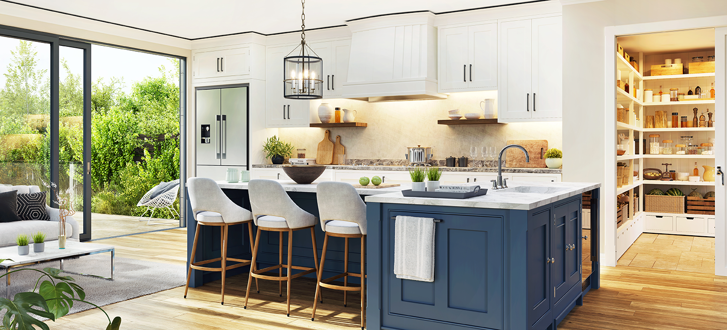
A real kitchen, in use. Wide shot. Available light. No staging.
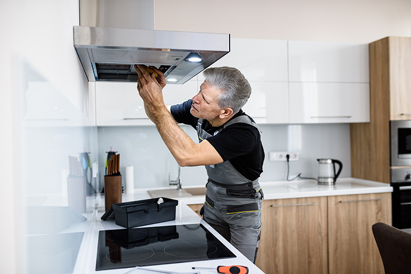
Do
Engineers at work
In workwear, hands working, focused on the appliance — not smiling at the camera. The work is the subject.
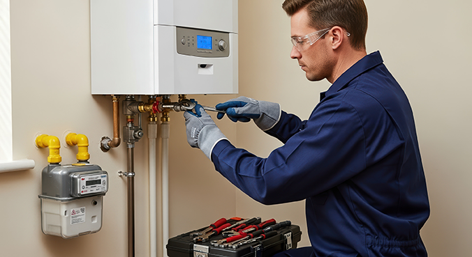
Do
Real repair moments
The service being delivered honestly. The homeowner may be visible in the background, in their own clothes, in their own room.
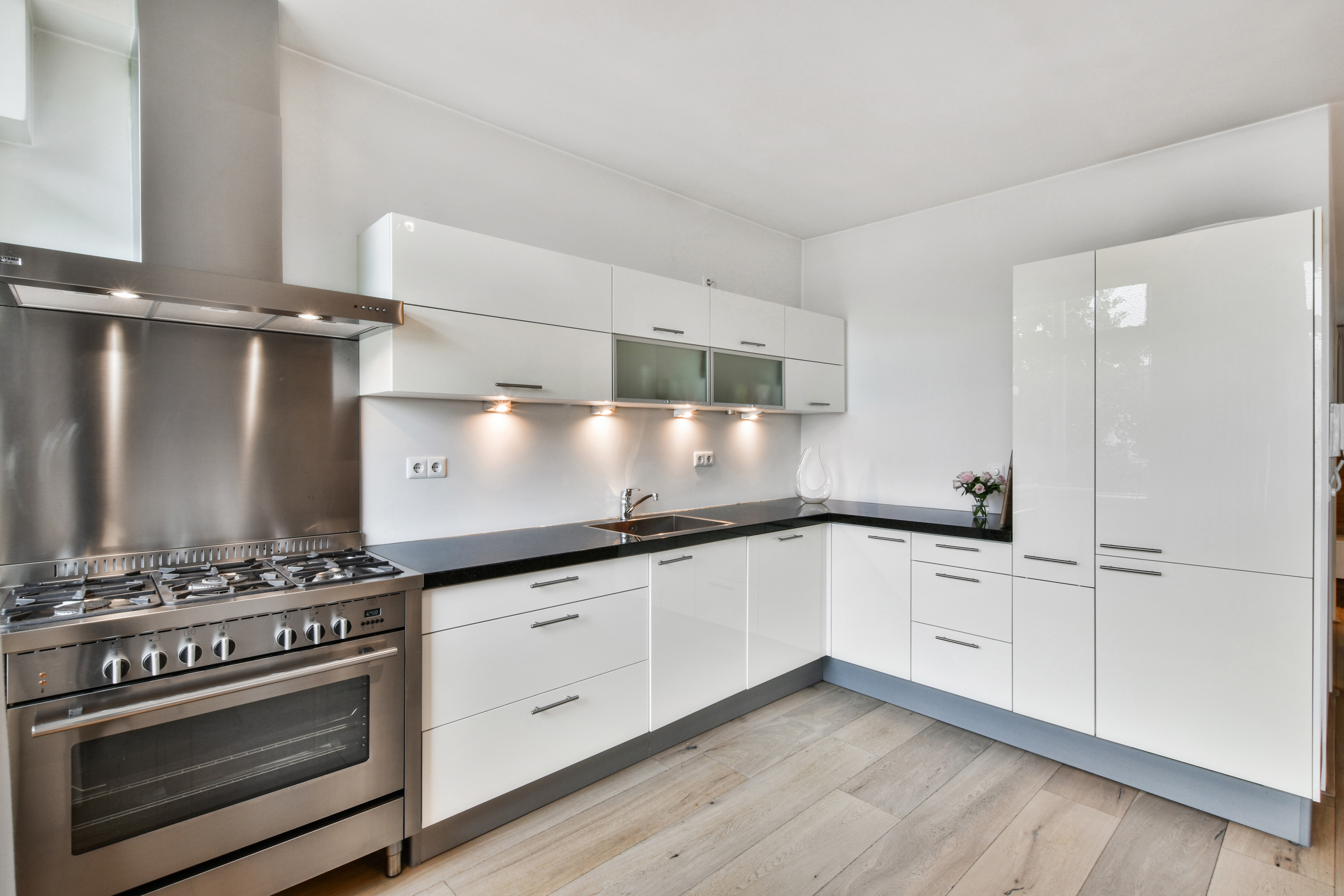
Not this
Showroom kitchens
Pristine, empty, aspirational. This register implies Homesy sells a lifestyle. It doesn't — it looks after what's already there.
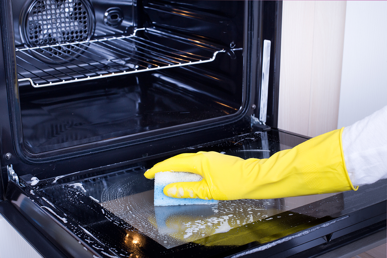
Do
Service in context
The service moment within the actual space it happens. Context makes the platform credible.
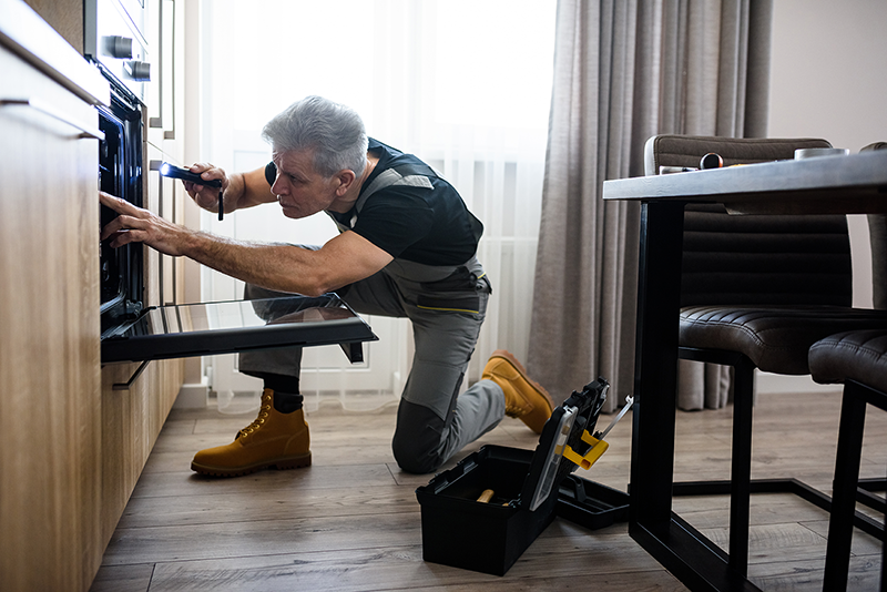
Do
Wide context shots
Wide shots that include the room. The room is part of the story. Tight crops that abstract the moment lose the documentary register.
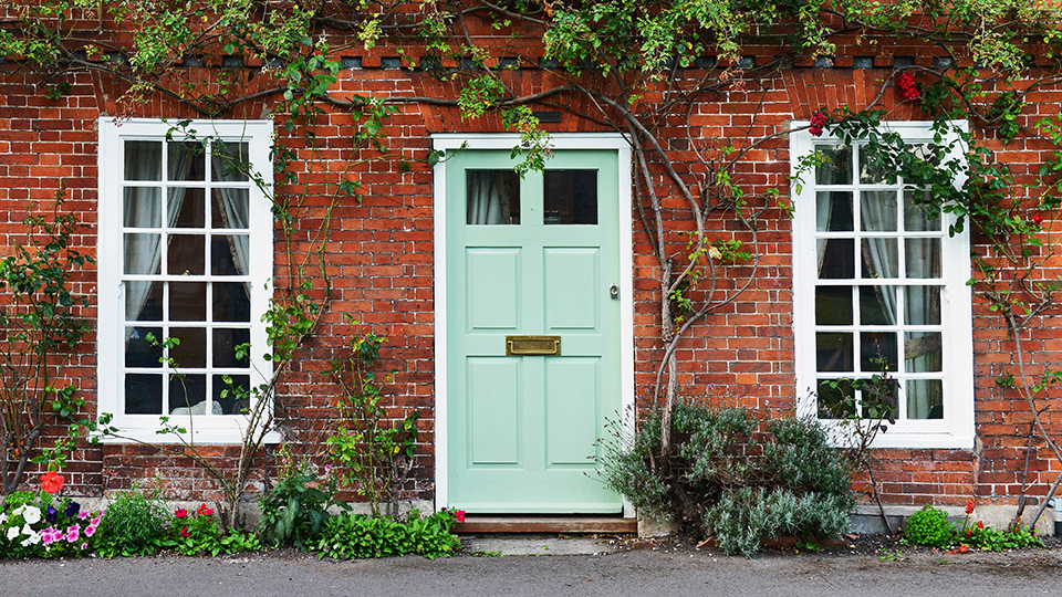
Do
Real homes
The homeowner's actual house. Not a staged exterior. Light that's available — natural, real — rather than manufactured.
Colour grading
Minimal. Slight desaturation acceptable. Warmth bias acceptable. Nothing more — no heavy filters, no saturated marketing-grade grading.
Crops
Wide where possible. The room is part of the story. Tight crops that abstract the moment away from context undermine the documentary register.
Captions
Present where the image carries informational weight. Sans 13–14px, --mute, italic optional. Factual, in the documentary register.
Text overlays
Avoid. If unavoidable, compose for the overlay (top-left or bottom-right negative space) and use a soft shadow — never a colour block.
Current photography mixes contextual lived-in homes with engineer and team imagery sourced from the Zest operation. The honest provenance ("built by the team behind Zest") makes this acceptable for now. The long-arc replacement is Homesy-livery imagery as the platform's operational footprint grows.
Engineer photography during the transition: Zest engineers are acceptable where the imagery captures the documentary register; remove or replace where the imagery captures the aspirational-Zest register that no longer holds.
Not currently part of the brand. If illustration becomes necessary — for an explainer, an unphotographable abstraction, an editorial moment — it must be commissioned in a register that complements the documentary photography rather than contradicting it. Line-based, monochromatic or restrained, never the cheerful flat-illustration default that startups reach for.
09 · Iconography
Icons appear where they earn their place — in navigation, functional UI, app surfaces, and trust strips. Not as decorative ornaments on marketing pages.
Line icons, 1.5–2px stroke. Lucide or Phosphor system at light or regular weight. One colour at a time, chosen by hierarchy.
16pxInline UI20pxNavigation24pxFeature lists32pxFeature cards48pxTrust strips1.75px stroke, round caps. Matches the brand register — light, calm, functional. Default for all surfaces.
Reads heavier than the brand register. Exception only: status indicators where filled is functionally required.
Style
Line icons, 1.5–2px stroke weight, round linecap and linejoin. Lucide, Phosphor (light or regular), or a comparable line system. Never mix icon families on the same surface.
Colour hierarchy
--green for primary icons. --text for secondary. --mute for tertiary/supporting. Status icons use --monitor or --alert only where status is genuinely communicated — never decoratively.
Filled icons
Not the default. Filled reads heavier than the brand register. Allowed only as status indicators where filled is functionally correct (active state, alert). Don't mix line and filled in the same surface.
Don'ts
No icons as decorative bullet points. No vendor or brand logos used decoratively — only where the reference is informational. No 3D icons, gradient icons, or icons with shadow effects. No colour icons or multi-colour icon systems.
10 · Components
Each component is extracted from the canonical Homesy site — named, specified, and given the rules under which it's used. This is the launch set.
On light
On dark
Four variants serve every context. Primary + secondary is the correct pairing — never two primaries in the same section.
Font
13–14px · Sans 500 · 1px tracking
Size
42px height · 26px H-pad · r 6px
Hover
opacity .88 · 0.15s ease
Small
btn-sm: 34px · 18px H-pad
One primary per section. Pair primary + secondary — never two primaries.
Content card
Feature block
White bg, 1px border. Feature blocks, FAQ, comparison.
Soft card
Lighter weight
--surface-green, no border. Inside coloured sections.
Tier card
Member · £9.99
--green bg, white text. Paid tier only.
Three card classes. Visual differentiation is carried entirely by background and border — never by competing visual weight.
Content
--white · 1px border · r 12px
Soft
--surface or --paper · no border
Tier
--green (paid) · identical dims
Gap
24–32px desktop · 16px mobile
Tier cards: identical dimensions, differentiated by background only. No BEST VALUE badge.
Eyebrow · 12px Sans · 0.12em tracking
Care · Appliance
Heading · Georgia 400 · −0.02em · lh 1.1
Lede · 17px Sans · lh 1.55–1.60
The lede sits below the heading. Centred for marketing, left-aligned for editorial.
Every section follows the same hierarchy. Eyebrow → h2 → lede → content block → optional CTA pair.
Eyebrow
12px · Sans 500 · 0.12em
Heading
44px · Georgia 400 · −0.02em
Lede
19px · Sans 400 · lh 1.55–1.60
Padding
96–128px desktop · 56–72px mobile
Centred for marketing sections. Left-aligned for editorial. Never mix within the same section.
Diagnosis outcome
Repair
£89
Restore. 45 min.
Like-for-like
£349
Same spec. 2–3 days.
Better
£499
A-rated. 5yr warranty.
Diagnosis result surface. Three panels: repair / like-for-like / better replacement. Identical structure — differentiated by the numbers, not by visual hierarchy.
Price
Georgia 28px · --green · lh 1.1
Layout
Three-column · equal width
Body
Sans 14px · --mute · lh 1.5
CTA
One per panel · primary / sec / sec
No "BEST VALUE" badge. No upsell tactics. The platform presents options honestly — the homeowner decides.
Free Member
Free
No card needed.
✓Appliance picture
✓Basic triage
—Unlimited Diagnosis
—Health check
—Cost-price access
Member
£9.99/mo
Cancel any time.
✓Appliance picture
✓Unlimited Diagnosis
✓Annual health check
✓Cost-price access
✓Welcome + care packs
Two-column layout. Member on the right with --green background. Identical row heights — difference comes from what each tier includes, not graphic emphasis.
Free tier
--white · --text · --mute absent
Member
--green · white · .55 opacity
Layout
Two-column · equal · Member right
Naming
"Included" · "£9.99/mo" only
Benefits are "included" — never "free". Never call the cost a "premium". No "Recommended" sticker.
Proof strip
10k+
Members
99%
Resolved
£124
Avg. saving
20yr
Operating
Proof points or partner logos as a horizontal strip. Statistics in Georgia — scaled to context, not blown up as decorative numerals.
Stats
Georgia 28px · --green · lh 1.1
Labels
12px · Sans 500 · 0.10em · --mute
Background
--white or --paper · 1px dividers
Logos
--mute opacity · informational only
No award badges or star ratings on hero or about pages. Trust strips at page foot are fine where the reference is informational.
What appliances does Homesy cover?
−All major household appliances at launch — washing machines, dishwashers, ovens, fridges, tumble dryers.
How is membership different from insurance?
+Is the annual health check included?
+Question in Georgia, answer in system sans. +/− icon signals state. 1px --border between items.
Question
Georgia 22px · --green · lh 1.35
Answer
16px Sans · --text · lh 1.7
Divider
1px --border between items
Motion
height:auto · 0.35s power2
Never truncate mid-sentence on collapse. The reveal itself signals expanded state.
Platform
How it works
What we cover
Membership
Company
About
What's next
Contact
© 2026 Homesy / Home Appliance Guard Ltd
Full-width --green band. Brand wordmark top-left. Two or three columns of links. Legal strip at the bottom.
Background
--green · full-width bleed
Text
--white · rgba(.5) secondary
Divider
rgba(255,255,255,.15) above legal
Legal
12px · rgba(255,255,255,.38)
Legal entity ("Home Appliance Guard Ltd") appears only in footer and regulated comms. "Homesy" throughout all other copy.
11 · Motion
Animation is purposeful and restrained — never decorative. Every Homesy transition is composited (transform + opacity only), brief, and decelerating. An element arrives; it doesn't perform.
Ease — enter
power2.out
All Homesy entrances
Ease — close
power2.inOut
Drawers, accordions
Hover / micro
0.20–0.25s
Button lift, tooltip
Component
0.35–0.45s
State changes, entrances
power2.out
ease: 'power2.out'
Decelerate into position. The element arrives with intention — it doesn't stop abruptly.
elastic.out
ease: 'elastic.out(1.2, 0.4)'
Bounce and overshoot belong in toy UI — not a home-care product.
Staggered entrance
stagger: 0.09
Each element rises in sequence — gives the eye a moment to follow content in.
All at once
stagger: 0
Simultaneous appearance creates a jarring flash — nothing leads the eye.
0.35s — snappy
duration: 0.35
Responsive and immediate. The UI acknowledges the user without delay.
1.6s — sluggish
duration: 1.6
Anything over 0.5s on a UI transition feels broken. The user waits on the interface.
duration-hover
0.20–0.25s
Button lift, tooltip reveal, icon swap
duration-default
0.35s
Component entrance, state change, modal open
duration-close
0.28–0.30s
Closing transitions — exits feel faster than enters
ease-enter
power2.out
All entrances and element transitions
ease-exit
power2.in
Exits — accelerate out
ease-inOut
power2.inOut
Accordion, drawer (defined start and end)
properties
transform, opacity
Composited layers — never height, width, margin
elastic.*, bounce
Never
Belongs to playful products — not Homesy
Composited layers only
Animate only transform (x, y, scale, rotation) and opacity. Never animate height, width, top, left, margin, or padding — these force layout reflow on the main thread and cause jank on lower-end devices.
Use autoAlpha
In GSAP, use autoAlpha instead of separate opacity + visibility. autoAlpha sets visibility:hidden when opacity reaches 0, removing the element from the accessibility tree without layout impact.
Respect prefers-reduced-motion
Wrap all animations in gsap.matchMedia('(prefers-reduced-motion: no-preference)'). Users who have requested reduced motion receive instant state changes with no transitions.
Stagger entrances
When animating a list of elements into view, stagger them at 0.06–0.10s each. This gives the eye a reading path and avoids the jarring simultaneous-appearance effect.
12 · App Design System
The Customer App and Partner-Engineer Portal share every brand foundation — colour, type, voice, photography — but operate with denser layout, smaller type, status colour switched on, and a component vocabulary built for mobile-first surfaces.
Status colours · App only
42 Millbrook Lane
South London · SE22 · 4-bed
Quick access
Heating
White goods
Maintenance Compliance
Last checked today · Next service 32 days
Due soon
Boiler Annual Service
Heating · South London partner
Washing Machine Filter
White goods · 60-month check
Completed
Dishwasher Descale
White goods · Treatment
Recommendation
"Your washing machine drum bearing is showing early wear. Book a partner visit before it worsens."
Georgia carries the numbers
Every score surface (Maintenance Compliance, Appliance Condition, Picture Completeness) must use Georgia — not system sans, not bold sans. The brand voice runs through the typeface, including in data display.
Status colours are app-only
Healthy, Monitor, and Alert colour tokens are active in app surfaces only. Do not use them on marketing pages or in the wordmark context. Marketing communicates aspiration; the app communicates state — keep them separate.
Re-tokenise before launch
Any surfaces carrying Zest-era styling (Brand Green #3A5C4F, Montserrat, DM Sans) inherited from the prototype must be re-tokenised to --green #1A2A24 and the Georgia + system sans stack before the app ships.
Mobile-first, not mobile-only
Design for the mobile viewport first. The desktop view is a faithful expansion — the same components, wider. Never design a separate desktop composition that doesn't map directly to its mobile counterpart.